Unification of SK Social Enterprise CI 'Haengbok Logo'


[Asia Economy Reporter Park Soyeon] Social enterprises and standard workplaces for the disabled established by SK are introducing a new CI (Corporate Identity).
On the 15th, SK announced that its social enterprises and standard workplaces for the disabled, which have used "Haengbok" (meaning "happiness") in their names such as Haengboknarae, Haengbok Connect, and Haengbok ICT, but have operated their symbols and logos individually, will now apply a common CI.
The new CI, called the "Haengbok Logo," is designed with the concept of "Seeds of Love and Happiness." It embodies the will to create and spread social value, just as small seeds gather one by one to form a beautiful flower field and forest.
Hot Picks Today
!["It Has Now Crossed Borders": No Vaccine or Treatment as Bundibugyo Ebola Variant Spreads [Reading Science]](https://cwcontent.asiae.co.kr/asiaresize/93/2026052019230771274_1779272587.jpg) "It Has Now Crossed Borders": No Vaccine or Treatment as Bundibugyo Ebola Variant Spreads [Reading Science]
"It Has Now Crossed Borders": No Vaccine or Treatment as Bundibugyo Ebola Variant Spreads [Reading Science]
- [Breaking] Samsung Union "General Strike Suspended...Tentative Agreement to Be Put to Vote"
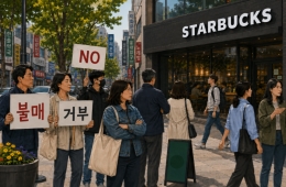
- [Report] "I Think Twice Before Going to a Store"... Starbucks '5/18 Tank Day' Controversy Grows
- "Stocks Are Not Taxed, but Annual Crypto Gains Over 2.5 Million Won to Be Taxed Next Year... Investors Push Back"
- "Who Is Visiting Japan These Days?" The Once-Crowded Tourist Spots Empty Out... What's Happening?
The Haengbok Logo comes in two versions: for social enterprises, the goal-oriented creation of social value is symbolized by a "paper airplane," while for standard workplaces for the disabled, a "heart" image representing a world without discrimination is used.
© The Asia Business Daily(www.asiae.co.kr). All rights reserved.