LG Unveils New 'Graphic Motif' to Express Vibrant Brand Identity

[Asia Economy Reporter Kim Heung-soon] On the 8th, LG Group unveiled a new 'graphic motif' on its website and social networking service (SNS) channels to represent the LG brand in a much more vivid way. A graphic motif is a design that can express not only the logo but also the corporate image, enhancing the image so that the brand can be recalled through colors, shapes, and patterns alone as visual elements.
LG's new graphic motif features the 'L' and 'G' shapes from the existing LG symbol mark placed respectively at the top left and bottom right of the screen. In addition to the LG logo expressed in two colors, red and gray, it allows free combination and use of 10 colors and 2 background pattern designs.
The 'L' and 'G' graphic motifs appear according to the movement of products or people and also express vibration and blinking effects. LG plans to utilize this graphic motif in various ways both online?such as on web and mobile homepages, YouTube, Facebook?and offline, including advertisements and business cards.
Hot Picks Today
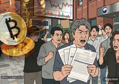 "Stocks Are Not Taxed, but Annual Crypto Gains Over 2.5 Million Won to Be Taxed Next Year... Investors Push Back"
- "Discussion Needed on Both AI Advancement and Protection of Citizens' Rights to Become a Top 3 AI Power"
- "Who Is Visiting Japan These Days?" The Once-Crowded Tourist Spots Empty Out... What's Happening?
- "Am I Really in the Top 30%?" and "Worried About My Girlfriend in the Bottom 70%"... Buzz Over High Oil Price Relief Fund
- "It Has Now Crossed Borders": No Vaccine or Treatment as Bundibugyo Ebola Variant Spreads [Reading Science]
An LG official said, "We developed the graphic motif to effectively represent the LG brand in various digital environments," adding, "Through this, we will strengthen the identity of the dynamic and evolving LG brand."
© The Asia Business Daily(www.asiae.co.kr). All rights reserved.