Naju City to Usher in the Era of 5 Million Tourists
Tourism Brand 'now naju' Confirmed
A City You Want to Stay In, Naju's Tourism Ambitions

Naju City has finalized 'now naju' as its Brand Identity (BI) to leap into the era of 5 million tourists. Photo by Naju City
View original imageNaju City in Jeollanam-do has ambitiously unveiled its new brand identity (BI) to usher in an era of 5 million annual tourists.
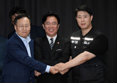
Recently, Naju City confirmed 'now naju' as its new tourism brand identity during the final report meeting for its tourism brand development project.
The word 'now' is an acronym formed from the first letters of Nice Attitude (hospitality toward tourists), Open Mind (an open and receptive attitude), and Warm Heart (a warm and caring spirit).
At the same time, it conveys the vision that from 'now' onward, Naju will make a full-fledged leap into the era of 5 million tourists.
The brand logo uses gray, symbolizing balance and harmony; orange, giving an energetic impression; and yellow, evoking positive and lively emotions.
Notably, the letter 'j' in 'naju' is accented with a light motif, expressing Naju's hope to become a brighter city through tourism in the future.
The letter 'u' is also differentiated in yellow, symbolizing both two people facing each other and a smile.
Naju City plans to actively promote tourism by linking and utilizing the new tourism BI with its existing regional brands as part of its marketing strategy.
Mayor Yoon Byungtae of Naju stated, "Naju's new tourism brand carries the message of creating a joyful Naju through a new horizon in tourism, realizing a friendly tourism environment where everyone wants to stay and visit again."
Hot Picks Today
 600 Million vs. 460 Million vs. 160 Million... Samsung Electronics DS Division: "Three Paychecks Under One Roof"
- Opening a Bank Account in Korea Is Too Difficult..."Over 150,000 Won in Notarization Fees Just for a Child's Account and Debit Card" [Foreigner K-Finance Status]②
- "Disappointing Results: 80% of Sunscreens Found Lacking in Safety and Effectiveness"
- "Not Even Buying a Bottle of Water": BTS Fans Outraged Over Price-Gouging by Busan Accommodations
- "Who Is Visiting Japan These Days?" The Once-Crowded Tourist Spots Empty Out... What's Happening?
© The Asia Business Daily(www.asiae.co.kr). All rights reserved.
!["Please Help Us": How Much Do Those Bowing Deeply for Your Vote Really Earn? [Data Pick]](https://cwcontent.asiae.co.kr/asiaresize/307/2026052010120870131_1779239528.png)